FotoWeb provides an easy way to customize the look and feel of the sites without modifying the templates directly. You can achieve a lot by simply changing the logos, fonts and color schemes of the pages to meet the company standards.
Appearances do exactly that. They allow you to create one or more themes that can be linked to the sites. A default appearance is always present in the system that all the sites are linked to by default.
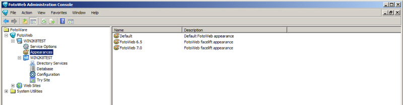
Go to the Appearances node located under the System node in the FotoWeb Adminstration Console. This program must be started from the server's start menu. You can't modify the Default appearance, but you can right-click on it to clone it and create a new theme.
After you have made changes to an appearance, you must assign that appearance to your site. This is done in the FotoWeb configuration module in the Operations Center, under the Site Configuration node in Site settings. (See here for an explanation.)
General tab
Name: Name of the appearance.
Description: A brief description of the appearance.
Identification: Name of the company as to appear in the templates.
Main logo: Main logo for the default splash page that comes up when accessing the FotoWeb site.
Titlebar logo: This is the logo that appears at the top of the screen after a user has logged in. We recommend a height of approximately 25 pixels.
Menu & Toolbars tab
Title Bar: Title bar that appears on top of all pages.
Normal Menu Item: FotoWeb generated menu item in unselected mode.
Selected Menu Item: FotoWeb generated menu item in selected mode.
Tool Bar: Toolbar with command buttons that appears on certain pages such as preview.
For a graphical explanation, see here.
Grid tab
Normal Thumbnail Item: Thumbnail in unselected mode.
Selected Thumbnail Item: Thumbnail in selected mode.
Page: Background color for all templates.
For a graphical explanation, see here.
Tables tab
Title Row: Header row of the tables.
Data Row: Data row of the tables.
Alternative Data Row: Alternative data row of the tables.
Other tab
Navigation Pane: Color scheme for the navigation pane in the grid page.
Fonts tab
This page allows settings of fonts for different controls in the templates.
A font can be defined with a font family, size in pixels, color and weight. In addition, basic text decoration can be applied.